I created a simple user control using the Popup control as a starting point. The end result is a nice little user control that can be used as a popup control to display a message. It has only 1 button on it (an OK button that closes the popup control). I’ll outline the basic steps of creating the User Control and how the popup control works with it. Of course, you can create a popup control without the user control, but its a much cleaner practice to create user controls.
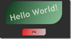
Step 1) Create a tester control. I called mine PopupTester.xaml. It can contain just about anything you want, in my case I put a funky looking green filled border on the control and a button, that when clicked will call the user control that we’re about to create. You can skip the code for the event handler for the button for now.
The PopupTester control is the default control that will be loaded when the Silverlight application is started. (Set this in App.xaml.cs)
Here is how the PopupTester control looks in Expression Blend. (It has no background color, which is why it appears gray.)
Step 2) Create a new User Control and name it MyPopupControl. The complete XAML for the control is shown a little further down. Remove the background, width, and height from the Layout Grid control so it only has a name property of LayoutRoot..
Step 3) Slap a Popup control in the main layout Grid. Name the popup control popMessage.
Step 4) Create a Grid inside of the Popup control. Create 3 rows and 3 columns in the Grid. Make the 2nd row and the 2nd column (the middle ones) have a Width = Auto. This creates a nice little grid that we can use to center the popup control contents. There are other ways to do this, but let’s swing with it.
Step 5) Add a Border to the Grid inside of the Popup control. Style the border however you wish, but make sure you give it a background color of some sort so it gets filled in. I gave mine a gradient background color from top to bottom and set the opacity to make it slightly transparent.
Step 6) Next, add a StackPanel inside of the Border, and stick a TextBlock and a Button inside of the Stackpanel. The TextBlock contain the message and the Button will be used to close the popup control. Name the TextBlock tbPopupMessage and the Button btnClose.
The XAML should look something like this:
<UserControl x:Class="SLPopupDemo.MyPopupControl"
xmlns="http://schemas.microsoft.com/winfx/2006/xaml/presentation"
xmlns:x="http://schemas.microsoft.com/winfx/2006/xaml"
Width="400" Height="300">
<Grid x:Name="LayoutRoot">
<Popup x:Name="popMessage">
<Grid x:Name="theBack" Background="#80000000">
<Grid.RowDefinitions>
<RowDefinition />
<RowDefinition Height="Auto" />
<RowDefinition />
</Grid.RowDefinitions>
<Grid.ColumnDefinitions>
<ColumnDefinition />
<ColumnDefinition Width="Auto" />
<ColumnDefinition />
</Grid.ColumnDefinitions>
<Border BorderBrush="#7F4895DE" BorderThickness="1,1,1,1" Width="400"
Height="200" Padding="10,10,10,10" CornerRadius="25,25,25,25"
Grid.Column="1" Grid.Row="1">
<Border.Background>
<LinearGradientBrush EndPoint="0.5,1" StartPoint="0.5,0">
<GradientStop Color="#FF000000"/>
<GradientStop Color="#CC4895DE" Offset="0.844"/>
<GradientStop Color="#FF346592" Offset="0.393"/>
<GradientStop Color="#FFFFFFFF" Offset="1"/>
</LinearGradientBrush>
</Border.Background>
<StackPanel Height="Auto" Width="Auto" Orientation="Vertical" >
<TextBlock x:Name="tbPopupMessage" Height="143" Width="Auto"
Text="Message Goes Here" FontFamily="Trebuchet MS" FontSize="24"
HorizontalAlignment="Center" VerticalAlignment="Center"
Foreground="#7FFFFFFF" TextWrapping="Wrap" TextAlignment="Center"/>
<Button x:Name="btnClosePopup" Height="30" Width="80" Content="Close"/>
</StackPanel>
</Border>
</Grid>
</Popup>
</Grid>
</UserControl>
Step 7) Now we need to ad some code to the MyPopupControl user control to create its event handlers. We’ll need events for the Button’s close event and to resize the control when the application resizes. So add the following constructor code to your code behind:
public MyPopupControl()
{
// Required to initialize variables
InitializeComponent();
btnClosePopup.Click += new System.Windows.RoutedEventHandler(btnClosePopup_Click);
App.Current.Host.Content.Resized += (s, e) =>
{
theBack.Width = App.Current.Host.Content.ActualWidth;
theBack.Height = App.Current.Host.Content.ActualHeight;
};
}
Using Visual Studio the event handlers are automatically created for the button. I used an anonymous delegate with lambda styling to for the resizing code just for fun. We could have simply created an event handler for it, though (like for the button). (Shawn WIldermuth inspired me to be creative with this technique after reading a post he wrote on creating a popup dialog, too. originally I had created an event handler for this, which is probably what I would od in a real application since I think its easier to debug & read.)
Step 8) Add the code to the button to close the popup control.
private void btnClosePopup_Click(object sender, System.Windows.RoutedEventArgs e)
{
this.Close();
}
Step 9) Create a public property on the user control to get & set the Message in the control.
public string Message
{
get { return tbPopupMessage.Text; }
set { tbPopupMessage.Text = value; }
}
Step 10) Create a public method to open the control and one to close the control.
public void Close()
{
popMessage.IsOpen = false;
this.Visibility = System.Windows.Visibility.Collapsed;
}
public void Show()
{
popMessage.IsOpen = true;
this.Visibility = System.Windows.Visibility.Visible;
btnClosePopup.Focus();
}
The code in the Show method sets the IsOpen property of the popup control, which makes the control open up. We also toggle Visibility. The Close method does the opposite.
Step 11) Go to the XAML of the PopupTester control and add the MyPopupControl user control as the last element just before the layout Grid closes.
<SLPopupDemo:MyPopupControl x:Name="myPopup" Visibility="Collapsed"/>
Step 12) Once you add this XAML, you will have to add a reference to the namespace at the top of the user control, too, like this
xmlns:SLPopupDemo="clr-namespace:SLPopupDemo"
Step 13) Go to the PopupTester control’s codebehind and add the following code.
public PopupTester()
{
InitializeComponent();
showButton.Click += new RoutedEventHandler(showButton_Click);
}
void showButton_Click(object sender, RoutedEventArgs e)
{
myPopup.Show();
}
This code adds the event handler for the button that will open the MyPopupControl instance. The event handler simply calls the popup control’s Show method, that we created in the previous step.
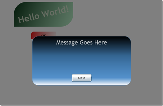
Step 14) Now compile the app and run it. When you click on the button it the popup control will appear to be in front of the entire PopupTester control (because of its gray slightly transparent and stretched background. Like this:
No magic, just pretty simple code and layouts.
Here is the source code …. Enjoy!


