Last week I posted the code for a swivel behavior I created. It rotates a set of panels 180 degrees. The next step in the rotation process is to add a button that causes the rotation from front to back and then from back to front. This post will talk about how to create a button that does this rotation.
Here is the final result …
<div id="silverlightControlHost_0001"><iframe style="border-right-width: 0px; width: 0px; border-top-width: 0px; border-bottom-width: 0px; height: 0px; visibility: hidden; border-left-width: 0px" id="_sl_historyFrame"></iframe></div>
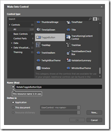
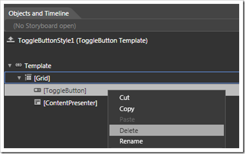
<p>First, I created a copy of my panel demo page from my previous post. I removed my Swivel behavior that I used in the previous post since it kicks off when the grid is clicked. I will replace it shortly. Then I dragged a ToggleButton onto the designer from the Assets window in Blend. I want a ToggleButton here because I want the button to perform a alternate animations when the button is clicked. So I intend to use the checked and unchecked state of the ToggleButton to invoke the different states. </p> <p>Once I added the ToggleButton I decided I wanted to change its look. I created a style for the ToggleButton bu right clicking it in the designer, choosing “Make a Control”, selecting ToggleButton as the type, and adding it to the app.xaml. This created a resource style so I can completely change the look and feel of the ToggleButton. The image on the right shows this process.</p> <p>The designer then switches over to let you view the resource you just created. I then removed the ToggleButton form the ControlTemplate since I do not want the basic gray rectangular button. The screenshot below shows me deleting the ToggleButton from the ControlTemplate.</p> <p>
 </p> <p>I replac
 ed the ToggleButton that I removed with a Border. I made the Border have a large corner radius so it looks like a circle, and I filled it with black. Then I added a Grid inside the Border, and put a Path inside the Grid. The Path looks like an arrowhead (I’ll demonstrate how to make the Path in a future post using some techniques Corey Schuman shared with me). So far my new style for the ToggleButton looks like this:</p> <p>The button needs to show the user that it is ready for action. So while the button is in its “Normal” state I set its Opacity to 40%. When a user hovers (MouseOver) over the button I want the button to change its Opacity to 100%. This screams for the Visual State Manager to lend a hand. So first I selected the outermost Grid panel of my RotateToggleButtonStyle in the Objects and Timeline. Then I click on the States panel and selected the “Normal” state. </p> <p>
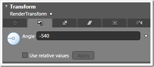
 </p> <p>Also shown in the image above is that I set the default transition for the Normal state to .25 seconds and set the easing to use an Exponential EaseInOut. This gives the effect a slightly softer transition. Now that Blend is in recording mode, I set the Opacity in the properties window to 40%. Then I click on the MouseOver state and chaneg the Opacity to 100%. </p> <p>I also want this button to rotate –540 degrees when checked so it spins counterclockwise 1.5 times. The ToggleButton also has visual states specific to the ToggleButton such as Indeterminate, Unchecked and Checked. This helps me get the rotation animation, which I want to occur over a period of 0.8 second. First I set the default transition for the CheckStates to 0.8 seconds and set the easing to an exponential EaseInOut. </p> <p>
 </p> <p>Then I click the Unchecked state and set the Rotation Transform to 0 degrees. Then I click the Checked state and set the Rotate Transform to –540 degrees (see below).</p> <p>
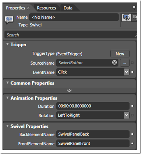
 </p> <p>Now my RotateToggleButtonStyle is done including its rotational animations, so I close the designer for the resource and I go back to my user control. My ToggleButton has now changed in appearance since it uses the resource I created. The last step is to add my Swivel behavior to the ToggleButton by dragging it in Blend. Then I set the properties of the Swivel behavior to to be invoked on Click of the ToggleButton, use a duration of 0.8 second to match the button rotation, rotate left to right, and use the 2 panels I created (see below).</p> <p>
 </p> <p>So now that I am all done, you can see the demo at the top of this post. Just click the toggle button and watch it go. Click it again, and watch it flip the panel back and rotate the button to its original state.</p> <p>You can download the code for this sample here.</p> <p>Or view the demo here outside this post.</p> <p>Next time I’ll demonstrate how to make the Swivel behavior use 2 buttons: 1 to flip front to back and to flip back to front. I have had some requests for this for the cases when you want to put the buttons on the panels that swivel and make the buttons look different.</p>


